It isn’t often I get to use my design skills but when I do I have a good time creating something visually compelling. Even when it is tricky because merging my artistic eye, marketing mind, and images into something that also satisfies clients can be very tricky.
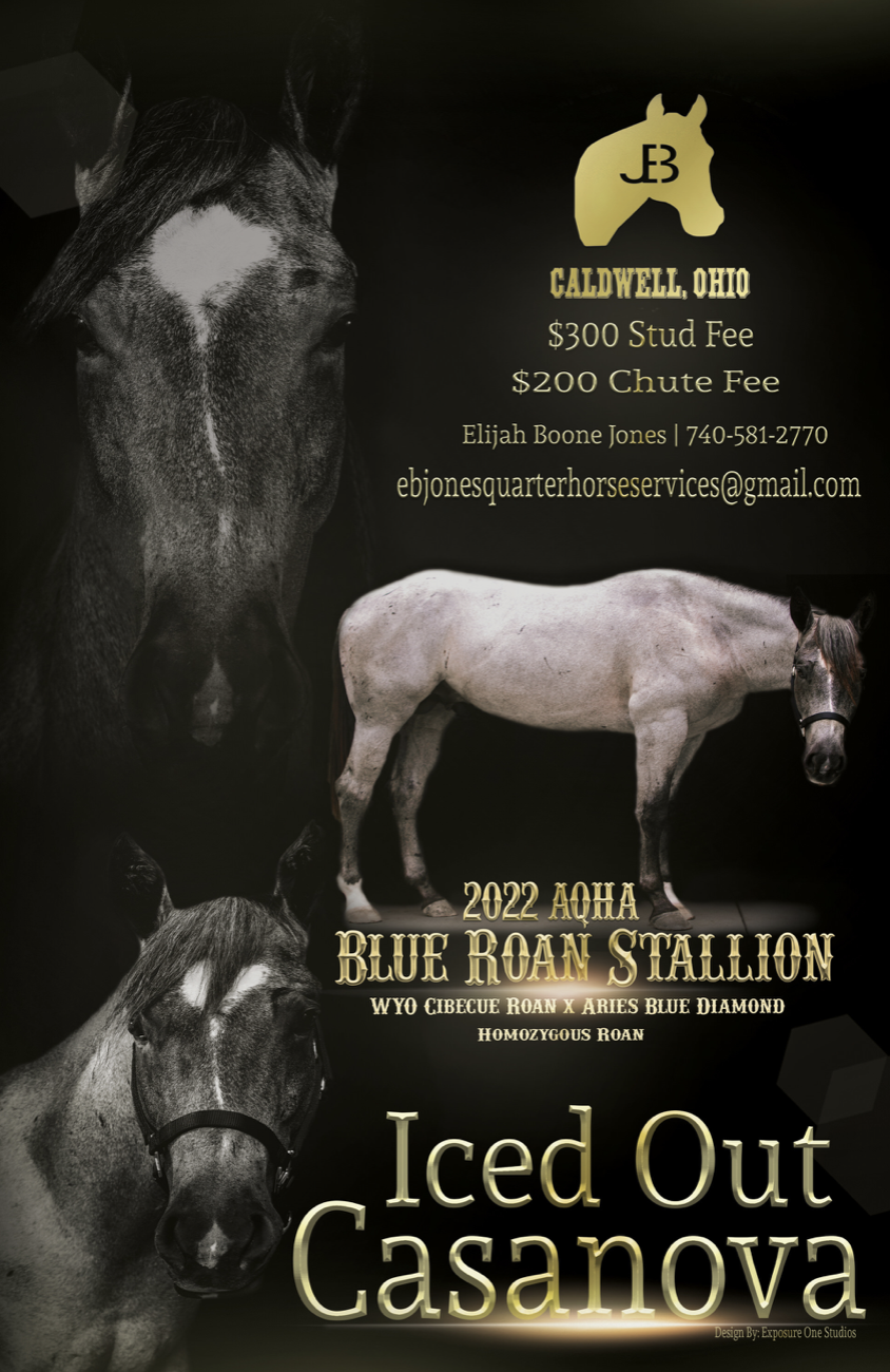
Nova’s ad was challenging because I definitely had an idea before even seeing the equine in person about what I was wanting to create, and then that idea was in direct opposition to the client’s asks. However trying to blend the two while making something that was visually compelling was the goal.
In the end I created and delivered five ads to the clients, hoping they were happy even though my package covered one ad with a redesign. The goal is always making clients happy and when they kept coming back with asks I knew I wasn’t getting it there for them. And thus five ads later I can only hope I made something they were seeking,
Making a stud ad is complex. No two horses are the same, no horse photographs the same as another, and every ad has to be built with text in mind including logos and other elements. The goal of the ad is to show off the confirmation of the stallion as well as provide prudent information; color testing, panel testing, bloodlines, locations, transport fees, over all fees, and contact information.
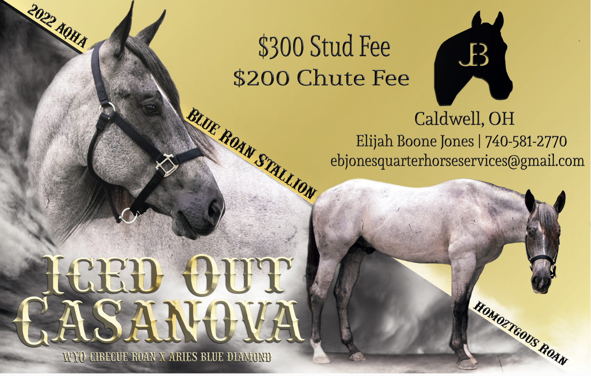
It can be a lot and sometimes I want to create a BAM design, and sometimes I want to go simple and uncomplex. I was feeling an overlay image at the top of Nova with a full body shot and then info built around them. I had had that in mind from the very beginning meaning the photographs I took were in support of that vision. While the clients had hoped for three images of the horse on the ad, with ice in the background on black with gold text. It was do able but felt busy.
Thus leading to numerous designs. However with every design I made a Timelapse of the ad Creation. Check out the videos below.
While the time-lapse videos don’t begin to cover the scope of the ad designs and changes they are fun to watch. I did make one of the two other designs but they were so simple you couldn’t really see anything and thus only the three ad videos above.
However I am sharing all the ads below. Please drop a comment telling me your favorite ad!


