A good friend of mine mentioned something about potential doing some blog posts that offer critiques as a learning opportunity for photographers. At first, I was like there is no way I can do that no one would care!— In the back of my head I was like ‘I am not a professional!’ You know that age old imposter syndrome rearing its ugly head. But then I stopped myself and asked why not?
I have been a photographer for 12 years, a freelancer for 11 years, and a business owner for 7 years. By Malcom Gladwell’s estimation of 10,000 hours equals mastery; I have definitely hit that mark. I have mentored, I have taught, and I have officially been a judge of others work in photography. I have been consulted as an expert before so it is literally just my negative inside voice yammering that I still have no idea what I am doing…. Ok, sometimes I actually don’t but semantics.
So I do want to start doing critiques more officially than sending an image to a friend being like look at this they needed to do this, this, and this is off, making viewers feel this when you can tell from the styling that wasn’t their actual end goal.
So let’s kick this off with the very image that triggered the entire conversation and idea.
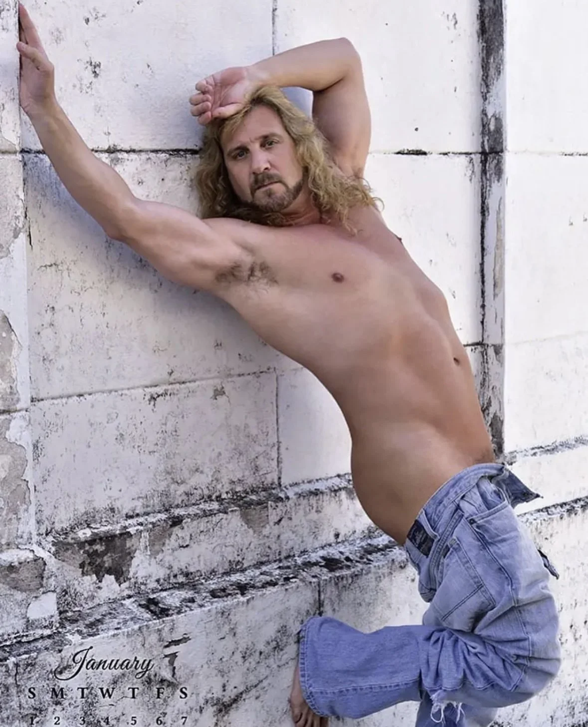
Model: Randy Scott | Photographer Diane M. Ellenberger | For The Duelist 2023 Calendar — www.theduelist.com
I am going to note that I was not asked to do a critique on this image but it appear on my instagram feed and I cringed. Not because of the more “erotic” nature of the image but because it plain scream uncomfortable and I will get into the why soon.
So lets start with what I think is right about this image:
It is Clear/Sharp: This image is clear and sharp, there is no blurring, no pixelation, and there are no dead spots. (Being a screen grab above you can see how well the true clarity comes thru.)
Decent Editing: The photographer did not over edit which can be a flaw to many modeling shoots. There are a few spots on the hind-end, thigh, pelvis area where you can visibly see retouching in the form of blurred pixels for a softer/cleaner look. Skin retouching isn’t unheard of and is expected what the photographer did well was she didn’t take away features that would have made the model appear younger— by that I mean facial wrinkles.
Ok Lighting: This image has decent lighting, you can tell it is natural, and outdoors. Overall the exposure is accurate and didn’t blow the white of the wall, but there is a lack of proper lighting exposure to the face to help draw attention, as well as a lack of contrast lighting on the body to help create something visually compelling to keep your eyes on the subject for more than a passing glance.
Lets talk about where I think this image went wrong:
Posing: The first thing I saw when I looked at this is a deeply uncomfortable man, in an uncomfortable, awkward, and visually limited position. No matter how I looked at the image I couldn’t see what the model was trying to do for his calendar of erotic images because the feeling of this image is ‘Hurry up and get the shot my back hurts.’ If we break down the pose the arm extension to grip the wall lends to the idea the model is falling over in a sense, the causal model arm over the head just doesn’t fit the scene well and adds the feeling they didn’t know what to do with it and this was a last ditch effort. Then the arched back into the kneed leg while the intention is to add body shape it really just helped sell the idea the model is stumbling and falling backwards for this random wall to catch him. Overall, it isn’t my favorite pose, I would have played with angles and worked to make it look and feel more natural.
Dead Eyes: Sometimes there is just nothing you can do when out shooting in natural light to get a spiciness in the face. When I was a teenager I use to love America’s Next Top Model — not because I wanted to be a model but for the images and yeah the critiques— one thing I always tell my subjects is while the methods weren’t the best Tyra’s show was right about how much the eyes in any shot matter; even erotic ones where the focus is the body. The smize if you will would have been something the model could have brought to the plate to make him appear ‘alive’. The flatness of his eyes gives what I as a photographer call ‘dead eye’, there is nothing in his expression that says he is enjoying this and isn’t dead inside.
Bad First Impression: I wish I could say on first look this image screams “Yes! Almost naked man” or Thirst Trap Approved. But it does not, in fact on first glance I saw what I thought was a man falling back as he tried to pop a squat against a wall. That isn’t exactly a great first impression but hey if there is a funny story it would have held my attention longer.
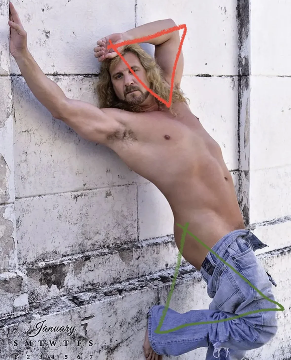
No Lasting Power: This image doesn’t have angles, features, backgrounds, colors, or anything that is going to make the image stay with you. The image is relying far too much on the appeal of a nearly nude man to attract, and keep a viewers attention. The eye bounces quickly from the first natural triangle (in red) to the second (in green) and then off the page. There is nothing, nothing to keep the eye attracted to the image and that can be one of the hardest flaws to fix. An image has to have something compelling to make the viewer stop and really see it and that is what this image is lacking at the end of the day.
As I progress in doing critiques for photographers— professional, beginner, hobbyist, and amateur alike — and you would like an image critiqued to see where you could improve and what you are doing well at feel free to send them to me via email @ exposureonestudios@gmail.com with the subject “ Photo Critique” and I will try to get them done and on the blog in as timely of fashion as I can!
Also hit the comments with whether you agree with my critique or not!


