
Last month I decided to start offering photo critiques large because I enjoy viewing artwork and sometimes they invoke a passionate response into what was done right and what needs a little refining. The first one was an image from Instagram that was included as the January image in a calendar and well I did not as a viewer respond well to the image.
This month is an image that was shared on Facebook from one of the pages my business page follows and it caught my eye immediately. So much so that I wanted to talk about it and decided it would make a great critique subject.
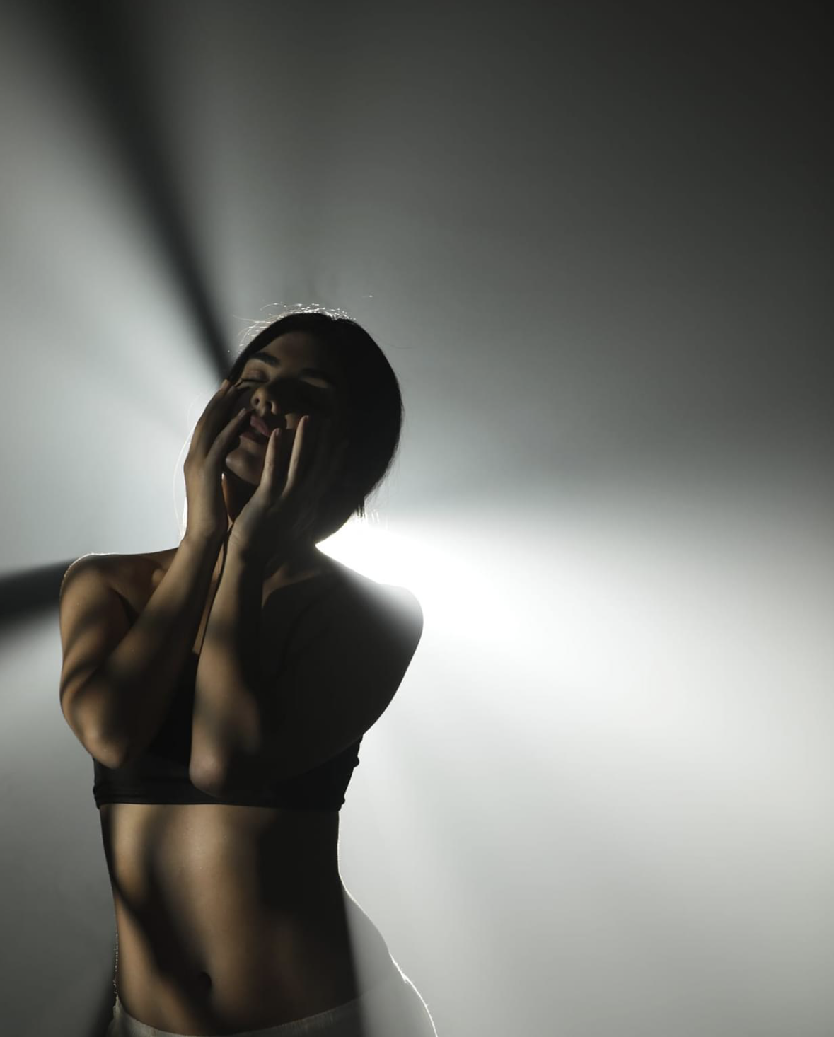
Piece Title: The Burden of Being | Pravin Talan Photography
Let’s talk about all the things this is doing right!
First off I just want to say wow! This image impressed me at first glance and even coming back hours later to write this I know that I am going to have to get really technical for looking for flaws.
Lighting: The saying is that lighting makes an image and that is and will always be the dead honest truth. If you took the glorious light and shadow play out of this image and had it exposed with plain, ordinary light it would lose its brilliance. The lighting and contracting shadows in this image that highlight the model’s body and face are impeccable. The lighting itself is telling a story if you stop to witness it. The photographer here has a masterful understanding of lighting and shadows and their importance to make an image sing.
Lasting Power: I am potentially going to dream about this image. I can see this image in print, I can see this image displayed as art in a home. This image has lasting power in spades, it might fall out of the forefront. your mind but a casual glance will bring it back and make you take a longer look.
Emotive: The image conveys an emotion to the viewer and it will vary from viewer to viewer. For me, it conveys a sense of relief after a workout session in the evening. It takes me into myself and my experiences, I am not the model, I am not in the studio to make this piece, but I can feel that I have been in this pose, felt this expression, and the lighting imitates that which I have seen after my workouts.
Quality: This image is a screenshot and yet you can make out the quality of the original. Sharp pixels, not over or under-exposed. The quality is superb.
Model: The model nailed this pose, she looks comfortable and engaged, and that reads into the quality of the image. Her comfort in the scene reflects the photographer’s talent to bring ease to his subject to create provocative work.
Let’s talk about the very few things I think could be better. I not going to lie there is so little wrong with this image I had to really delve into things that the average person would miss and that aren’t huge deals by themselves.
Needs a Little Clean-Up: So in the duplicate image down below in yellow, I circled two areas that could be cleaned up. These are stray hairs and fly-aways that are common to almost everyone and they lend to the story but for a cleaner, sharper image cleaned up, they could elevate this even further.
Dead Pixel?: The red circle indicates an area of either a dead pixel — missing or a dark or bright spot. I am assuming this is a dead pixel because it looks like a spot to me but there is the potential that this is a reflection of light off a flyaway of the model’s hair. To the regular viewer, this is something you are never going to notice and even most professionals would glance over it. Now that I have zoomed in and pursued the image I can’t unsee it but it is a simple fix in post-production. Sadly dead pixels can not be fixed so knowing you have one means you can look out for it when editing your images.
If you would like an image critiqued please email me at exposureonestudios@gmail.com with the subject Image Critique.
