In my fourth critique I have decided to try something a little different and look at one of my own images because even as a professional there is always room for improvement and I should be able to see those areas within my own work as much as someone else’s.
So with that said what this image did right:
Composition: This image has a compelling composition that draws the eye in and keeps its attention.
Lighting: The lighting in this image is dynamic and frames the subject in such a way as to place it on display and highlight it at the same time.
Impact/Color: The color composition is limited but offers deep shadows that contrast nicely with the highlights creating a very impactful product image.
Things I could have improved upon…
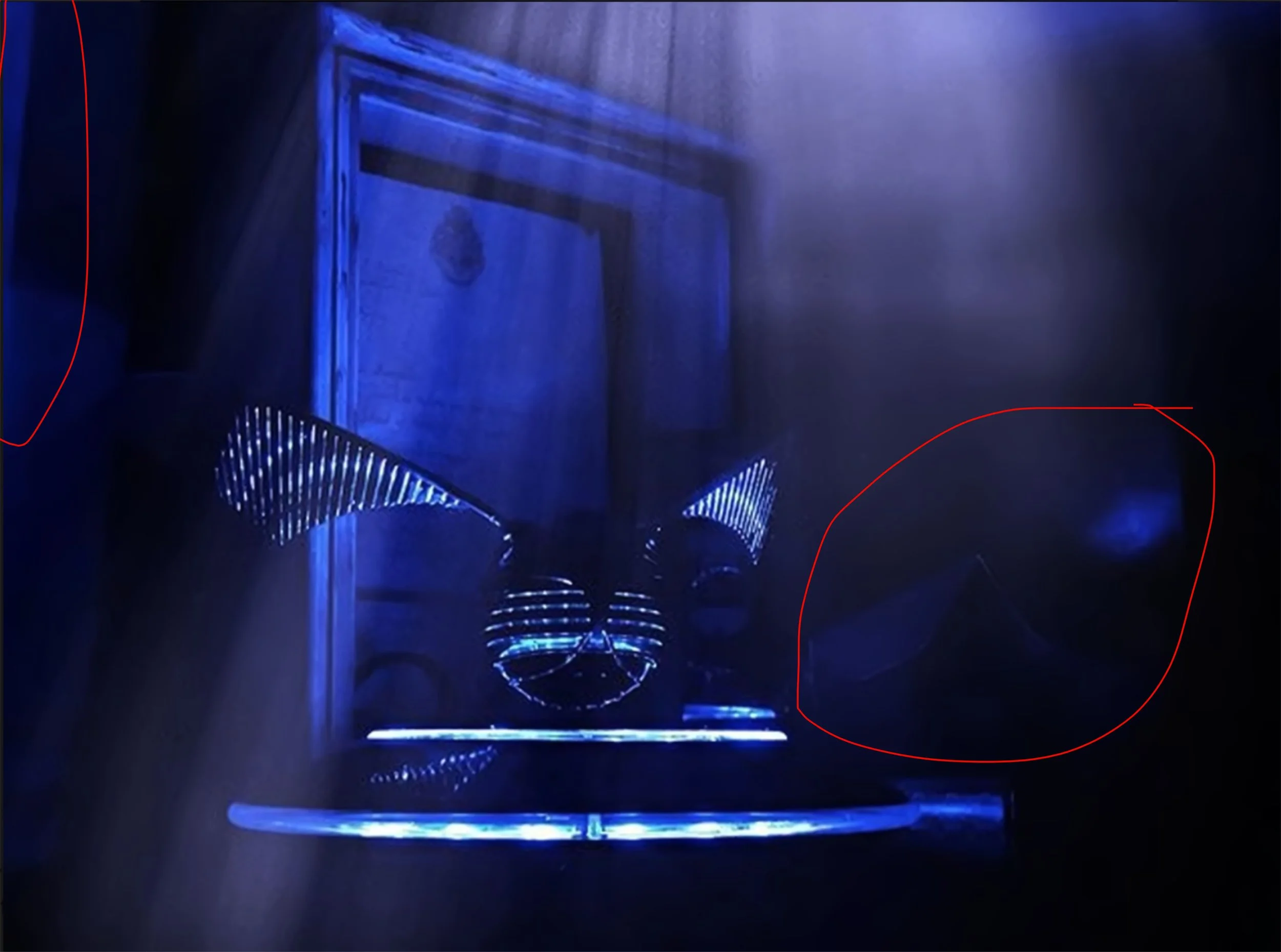
Distractions: Circled in red below are two areas I find distracting within the image. One the left it is an area of pure color that doesn’t really fit well with the darker tones and needed blended out better or cropped out. In the red section on the right the glowing blue reflection and bit of an envelope are also a distraction. Had I taken a little more time I could have removed the envelope from the set up and the light glow needs edited out.
Using the Professional Body over Cell Phone: This is more a personal thing vs an actual problem. I feel this could have been more impactful on the professional body with a wide angle lens vs using my iPhone X to create it. While iPhones have vastly improved I still find their image quality pales in comparison to my professional set up.
Overall, even as one of my better still lives that the company that produced the Levitating Snitch reached out to use for marketing it still has room for improvements.


