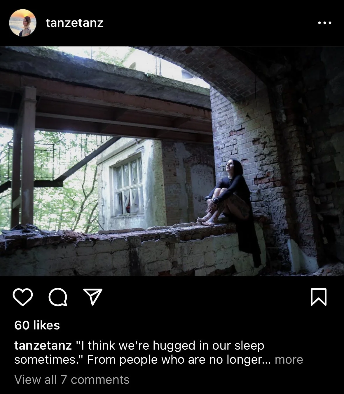
In my third critique I found this image like two months ago on instagram and it called to me in such a way I was like ok I shall choose you. No, not because there is really anything wrong, in fact I really like this image and wanted to talk about they why.
So what this image did right:
Composition: The composition of the image is spot on. The model is placed following the golden rule (aka rule of thirds) and there is a dynamic enough background and foreground to set the scene well.
Storytelling: You can imagine that something happened to upset this girl and she ran to a run down area to be alone and reflect upon what has happened. The image is masterful at portraying a story, even a different story to everyone who views it.
Lighting: It is well lit with nice and deep shadows and a clear understanding of the direction the light is coming it. The model is well light which helps keep the focus on her.
Things I think could use improvement… and there are not many things.
Tone: The coloring tones feels on the cool side, throwing the whites off and giving them a slightly blue cast overtone. The coolness makes it appear as if the white balance is off and therefore the photographer did not adjust settings accordingly.
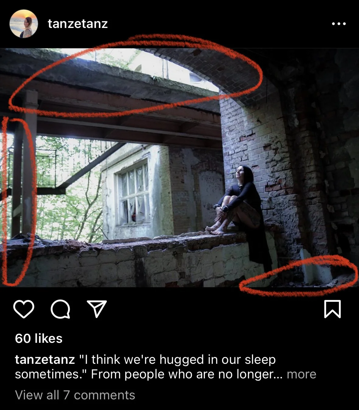
Distractions: Circled in red below are three areas I find distracting. The top draws the eye up and out of the image which isn’t good as the idea is to bounce the eye around and keep the viewer engaged. The one of the left draws the eye and again leads it right out the image and the space right hand bottom just minor thing and personal annoyance. The camera tilt let just a sliver a flooring be visible and I find it distracting.
Overall, I really like the image and there isn’t much necessary to bring it to the next level. A lot of my ideas for improvement are based on personal taste rather than lack in skills on the photographers part.


